
Inspire Notes:
This building is an astonishing renovation and re-discovery project undertaken by Italian architect Sabrina Bignami.
The Casa Orlandi guesthouse is an 18th century palazzo situated close to Florence.
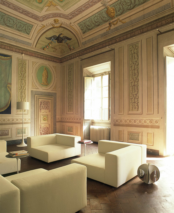
On another note, how delicious are those sofas?

You will notice that the *frescos, which were surprisingly bulldozed over with paint, have been meticulously and gingerly uncovered by a
fresco restorations expert. The original artist was Tuscan based 18th century painter Luigi Cantani who must be smiling from an artistic
heavenly place as Ms Bignami oversees the painstaking restoration of his fine work.
*fresco ~ the technique of painting directly onto wet plaster.

I am loving ‘La Grande Eff You’ waterfall chandelier…in the kitchen no less, (not it’s official name!) – very Josef Hoffman in it’s exuberant style.
This is statement accessorizing at it’s finest. And the evocative antique floor tiles are singing from the same vintage hymn book as it’s collective surroundings.

The large triple framed antique mirror is behind the cooker(!) and was placed there to serve as a back-splash to protect the frescos.
But it is in keeping with the style of the space and does not look ill placed…even though it is certainly unusually placed!

The sheer essence and vibe of this purple room created from the super-sensitive restoration and the empathetic interior design is quite disgustingly amazing.
One can almost smell the faint musk of history from the image.

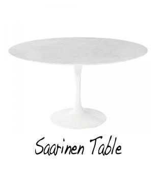
Whilst restoring the history of the building, the architect has infused it with clean modern furniture lines such as the Saarinen Tulip chairs
and table above and the hyper-flowing Verner Panton chair a few pics above.

Using an antique tailors dummy as a utilitarian style piece is a criminally inspired idea in this dressing room above. Ms Bignami continues
the use of run-of-the-mill everyday objects turned into style accents with her use of traveling trunks in the bedroom below. It is not that this
is such an original idea, but it is the flair in which it is done that makes the difference. By flair I mean, look at the groupings of items, the
choice of furnishings, fittings, accessories and their thoughtful placement. Peep the way the designer has tried to continue the themes f
rom the fresco paintings in the various spaces.
And yet, if you can’t really see the thought that has gone into it all with a relaxed eye, the designer has still won.

” I play with contrasting style complement (sic) one another…the rich colours and ornate detailing of the frescoes and floor throw the clean lines of the
contemporary furniture and object that coming from “marchè aux puces” (flea markets) around the world and they are talking about my travels and my life…” Sabrina Bignami.
________________________________________________________________________________________________________________________


This place is quite special. Perhaps you do not have the limitless height that can accommodate the extra large chandelier seen above,
or your own home space is a masterful example of clean lined, box-shaped modernity, but one can still take on aspects of this unique
project. As pointed out before, it is how you use the things at your disposal. Verve and flair are free. To continue a point I made earlier
about the flair of the designer in grouping things, notice how she allies and communicates colour themes in a space, subtly, as in the travel
case room, (blue) and not so subtly in the lovely purple room, (purple). Then there’s the tan, light and dark chocolate of the dressing room.
If you look closely you will see the other obvious examples.
The home is a mix of modern furniture and accessories atop a European ye olde worlde feel. This is attained of course by the 18th century frescos
but also by the vintage finds Ms Bignami has utilized such as the distressed traveling trunks. If you buy new ones you can set to distressing it for yourself
by dabbing paint in places and wiping just enough off with a damp cloth to get that ‘used’ look. Also you can scuff any really ‘hey I’m brand new!’ shiny
bits by running some sandpaper over the surface. But to really acquire that super-distressed look, try throwing the poor thing around like a recalcitrant ex-lover!
One can only sit back and adore the style of the dressing room. Tres cool! Tres retro! The vintage tailors dummy stamps it’s authority all over the room already,
then in addition you could either have those open wardrobes made specially, or remove the doors from some old armoires or use garment rails to get the same
arthouse feel…Is it just me or can you also see a Sophia Loren type busty 50’s throwback, with blood red lips, jet black loose shoulder length curls and a l
arge beauty spot on her left cheek, sitting at the table smoking a Gitane with an annoyed expression on her sultry face?…Oh, just me then.
We have fresco painters in the Style Index for those of you who might want to really go for this look. I can see frescos looking quite amazing and chic
just on one wall in a room, or perhaps as a high border around the room where a frieze molding might go. Then to really go for this home style, s
ome antique floor tiling would seal the deal. Magnifico!


________________________________________________________________________________________________________________________

- see many more options from this style at the Style Index
Grazie tanto!:
Architect:
- Sabrina Bignami of b-arch studio
Photographer:
- Nathalie Krug
Sources:
Home owner:
